Bollinger Bands are a tool used by traders and investors to understand market volatility. There are two price bands plotted above and below a moving average line graph using standard deviation. The gaps between the bands from moving average lines represent market volatility.
Bollinger Bands are a trademark chart developed by John Bollinger, a famous technical trader, who used it to predict when market sentiment is shifting, setting off triggers when a stock is overbought or oversold.
In this graph, the middle line represents a simple moving average. And, the other two lines represent upper and lower limits, respectively, creating a price envelope. These bands are dynamic, which allow them to be used for different asset classes to understand price fluctuations and determine overall trends.
A brief history of trading bands
Before John Bollinger proposed his idea, there were other efforts to capture market volatility. As early as in 1960, Wilfrid Ledoux used monthly highs and lows of the Dow Jones Industrial Average to predict long-term market movement. After that, the history of trading bands got lost in time, until it was resurrected by Hurst. Inspired by Hurst, many others tried to construct similar trade bands but achieved little success. Then in the '70s, percentage bands became popular. It was easy to use and so found many followers. It was a simple moving average graph, showing highs and lows, plotted against a user-specified percentage. The modern Bollinger Bands are developed on the idea of Donchian Bands, which is a price envelope band showing the highest and lowest price differences for n number of days. However, Donchian Bands only taken into consideration recent highs and lows, which gives Bollinger Bands a clear advantage over it. It uses standard deviation, which makes it dynamic and adaptive to market pulses.
How to use Bollinger Bands
First moving average for a period, typically a 20 days simple moving average (SMA), is calculated and placed on a line graph. Next, standard deviation points are plotted against it to represent price fluctuation. Standard deviation is a mathematical process to calculate how much a value deviates from group average.
Formula to calculate standard deviation,
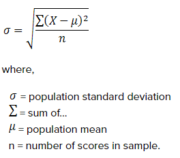
Standard deviation (SD) is the square root of the summation of the numbers in the population minus the mean divided by sample size. In Bollinger, upper and lower bands are calculated by multiplying SD by two and both adding and subtracting the number from the value to plot upper and lower values, respectively. Here is the formula used,
Bollinger Bands formula,
BOLU=MA(TP,n)+m∗σ[TP,n]
BOLD=MA(TP,n)−m∗σ[TP,n]
Where,
BLOU = Bollinger Upper Band
BOLD = Bollinger Lower Band
MA = Moving Average
TP= Typical Price (High+Low+Close) / 3
N = Number of days in Moving Average (typically 20)
M = Number of SD (typically 2)
σ[TP,n] = SD over last n periods of TP
Because of its simple approach, Bollinger Bands are widely used to predict when market sentiment is changing. It is flexible; and can be changed to suit the nature of a particular stock or trading pattern.
How to interpret Bollinger Bands
Bollinger bands can tell when the market is more volatile or less. The gaps between the bands from moving average line is a measurement of market volatility. When market is volatile, the bands drift farther from moving average graph and contract when volatility decreases. It also tells you when market sentiment is changing. Using Bollinger Bands trading strategy traders can predict when a stock is overbought or oversold. When stock price moves close to the upper band, it indicates overbuying. Similarly, when price moves close to the lower band, the stock is oversold.
Here is how to study the patterns
Squeeze
Squeeze is a part in the price envelope where the three lines come close to each other, indicates less volatility. Traders look for squeezes in Bollinger Bands to anticipate future market volatility and opportunity to trade.
Breakouts
Breakouts are price points that fall outside the price bands. It is not a common phenomenon and shouldn't be treated as a market signal. It only tells you when the market is more agile or less. A breakeven doesn't signal as to which way or extend the market will move.
W Bottoms
W bottom or double bottom is a technical analysis indicates when a stock price hits two low prices simultaneously, making a W pattern in a graph; hence, the name. It is a part of Arthur Merrill's work and used by Bollinger. There are four steps to identify a W in Bollinger.
On the first occasion, the price drops below the lower band, before it rebounds, followed by a second drop, which holds above lower limit. It is followed by a strong rebound that breaks a resistance level, completing the W pattern.
M Tops
M-tops is the opposite of W-bottom. It happens when a stock price hits the high, slumps to shoot up again and fall, representing a prominent M pattern. These highs are more complicated to interpret. The fact that the second-high fails to reach the upper band is a sign of waning momentum and indicates a trend reversal. Here is an example of M-pattern.
Bollinger warns that prices breaking upper or lower limits don't signal changing trends or give trading signals. The bands show when a stock is strong or weak. A momentum oscillator also works the same way. Prices close to upper limit don't indicate bullish trends and vice versa.
Limitations of Bollinger Bands
It is not a standalone tool. Bollinger suggested to use it with two or three other non-correlated trading tools to get right market signals.
Since it is calculated based on a simple moving average, more weight is placed on old data than recent ones. It dilutes the significance of new data and might impact decision making. Traders must adjust it to suit their needs and also must take current information into account while making trading decisions.
Explore the Share Market Prices Today
| Tata Steel share price | Adani Power share price |
| PNB share price | Zomato share price |
| BEL share price | BHEL share price |
| Infosys share price | ITC share price |
| Jio Finance share price | LIC share price |
Online share trading has transformed the way Indians invest in the stock market. With just a smartphone or laptop, you can buy and sell shares from anywhere, anytime — without paperwork or visits to a broker's office. Angel One's online trading platform gives you instant access to NSE, BSE, MCX, and NCDEX, advanced charting tools, real-time price feeds, and ARQ Prime AI-powered investment recommendations. Whether you want to invest for the long term or trade actively, online share trading puts the power of the markets directly in your hands.