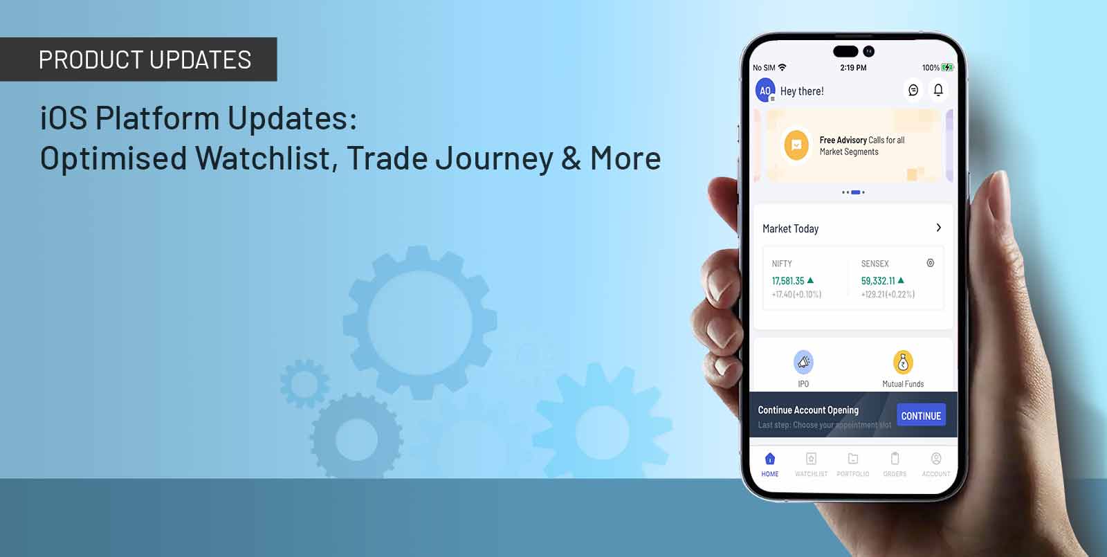
And we believe it to the core. Over the last 25 years, we have always improvised with time and we thrive to bring you the best with each update. Our engineering and technology teams have worked at lightning speed and with great commitment to bring you a seamless experience. So, here we are, with an upgraded platform, just for you!
Come explore our enhanced iOS and web platforms here.
So, what is new?
We have improved the user experience with more efficient & accessible real-time charts, upgraded payment methods, and so much more. We factored most of your feedback while building these updates.
1. Order journey revamp:
After a lot of research and feedback from the customers, we understood that the experience was not seamless as the process was becoming tedious for the traders which led us to revamp the whole order journey. So for a simplified experience and to help support a quick decision-making process for the traders, we have come up with the below updates:
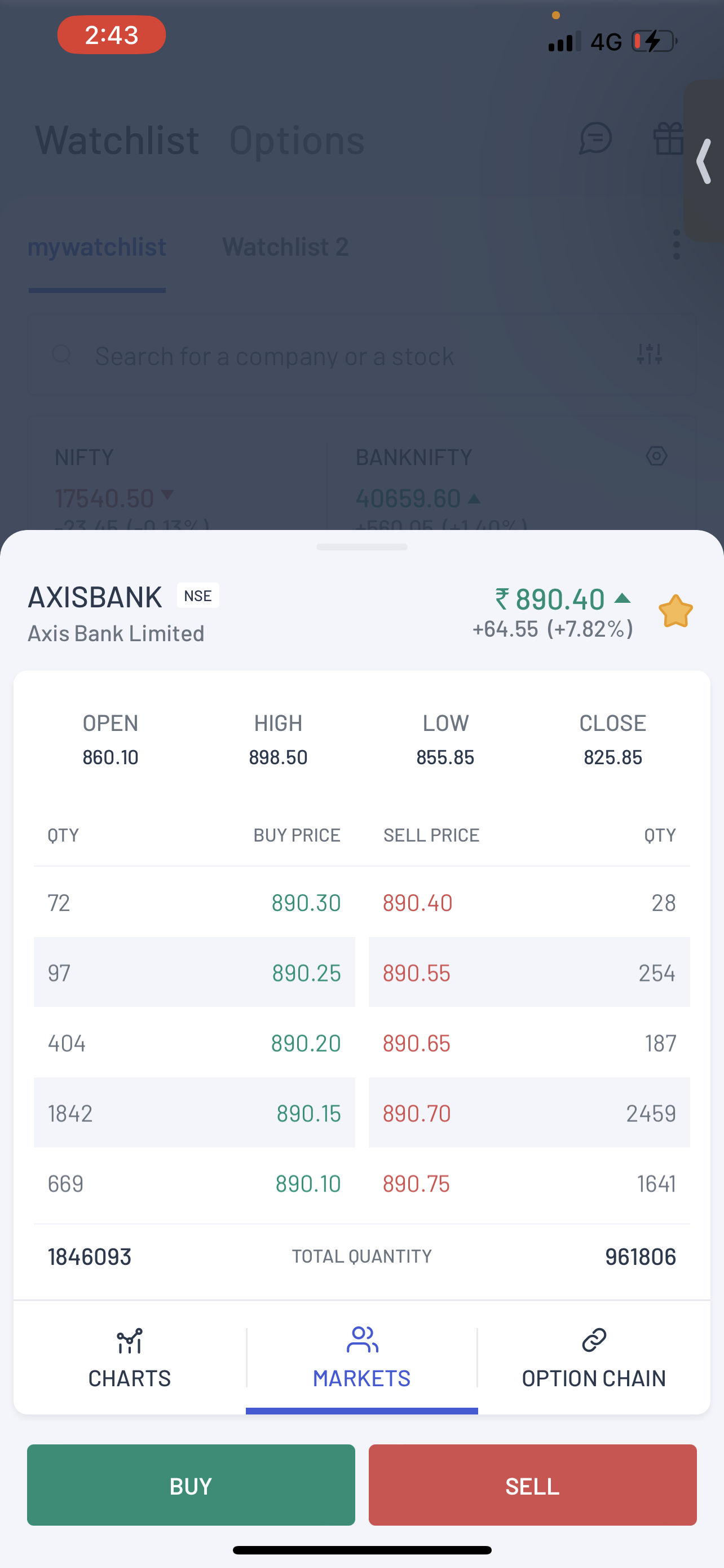
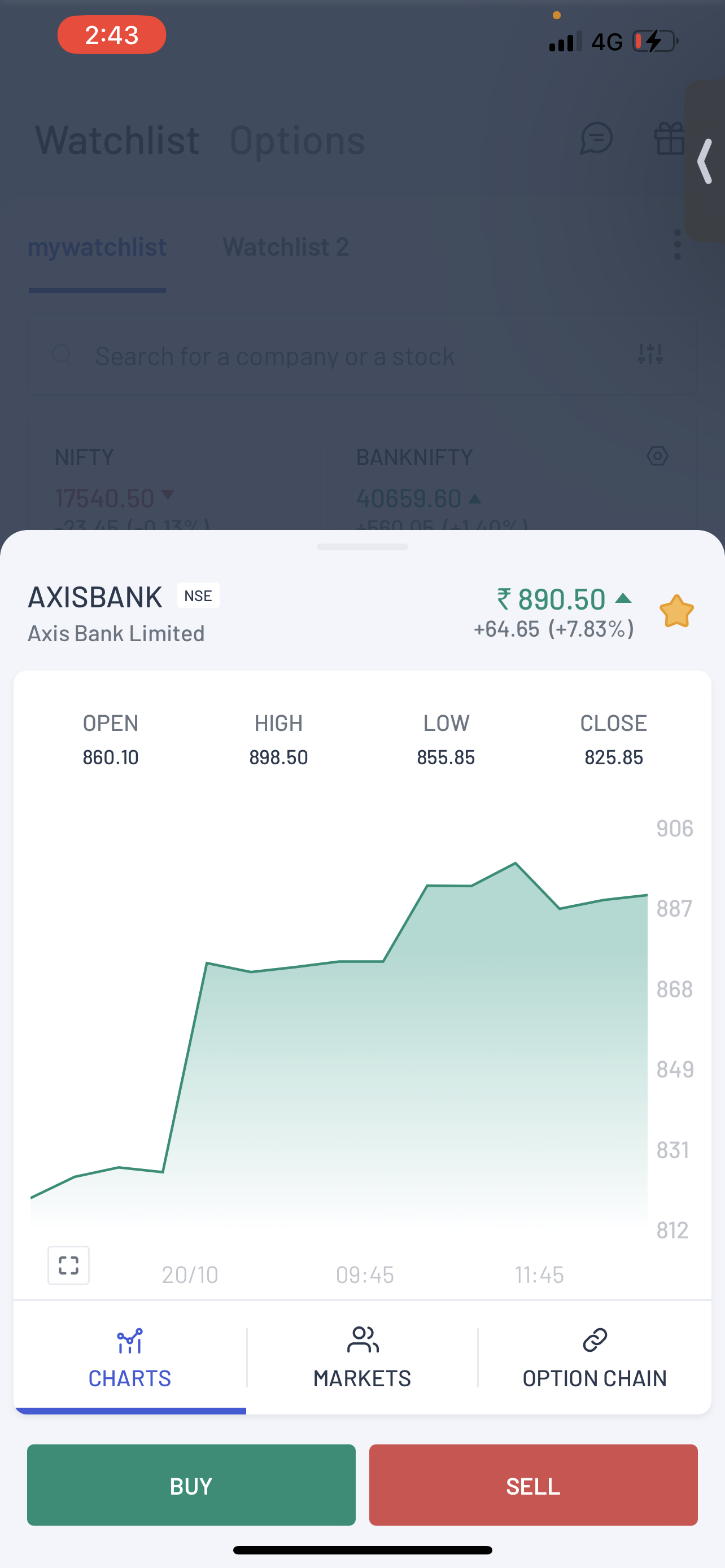
A: App Journey Reduction:
Say “No” to to-and-fro checks between charts and order books! Explore “Short Overview” in our latest upgrade. Now while the user taps on any of their contracts, it simplifies the process of viewing crucial information like: charts, market depth or options trading. Hasslefree and time efficient!
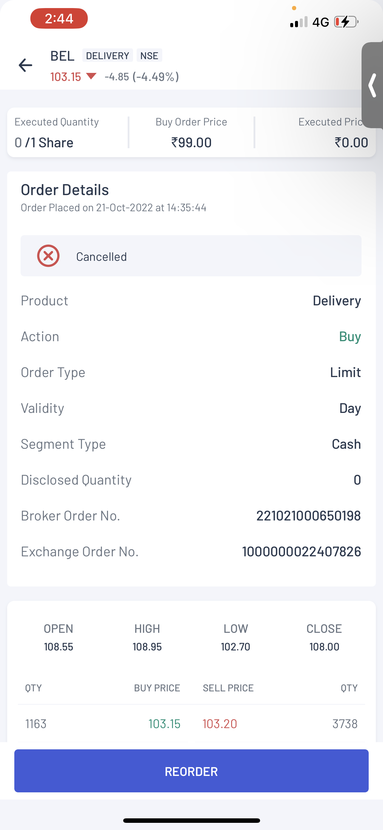
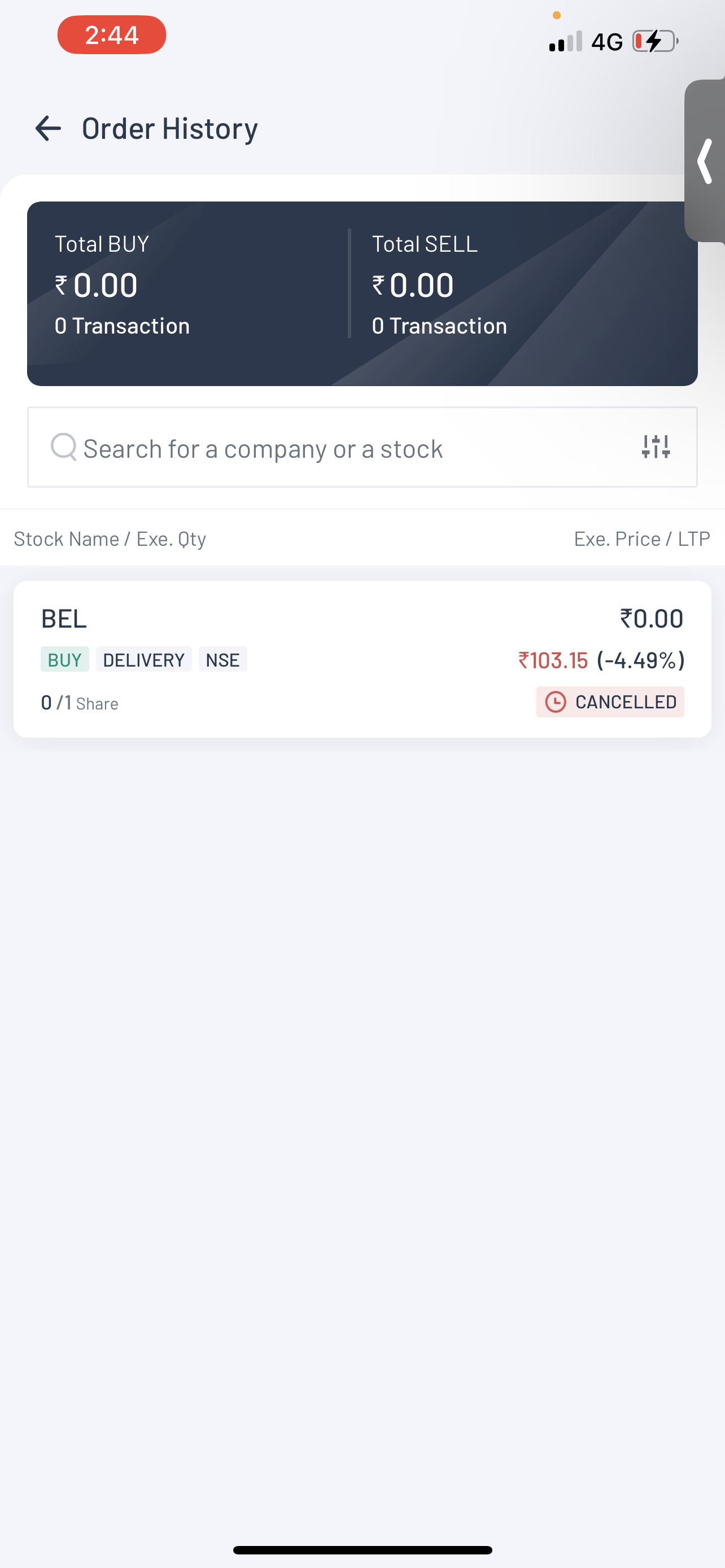
B: Inclusion of Reordering:
Previously, the reordering option was unavailable on the Order History Page. In our latest update, we have provided an Option for reordering where there is a possibility for a user to place an order like: Closed Position/Order History/Partially Closed Position/Trade history. For each apt screen, the LTP (last traded price) & the Chart History has been provided to help the traders to make a quicker decision.
C: Upfront Price Visibility:
Earlier, in Open Order & Order History as well, the order price and the executed price were not upfront. We changed the layout of the cards of the Open Order & Position. Taking the “most used details” upfront we changed the mapping of the information. As a result, all the relevant information is now visible at the top making it more user-friendly. This will help the users make quicker decisions to capitalise on each opportunity.
D: Relevant Action Buttons
We got feedback about fewer CTA buttons implementation. This led to a dragged-out process. As a result, we have provided two CTA (call-to-action) buttons: Option Chain & Order, on the charts. Now the user can easily look at the chart and make the proper decisions.
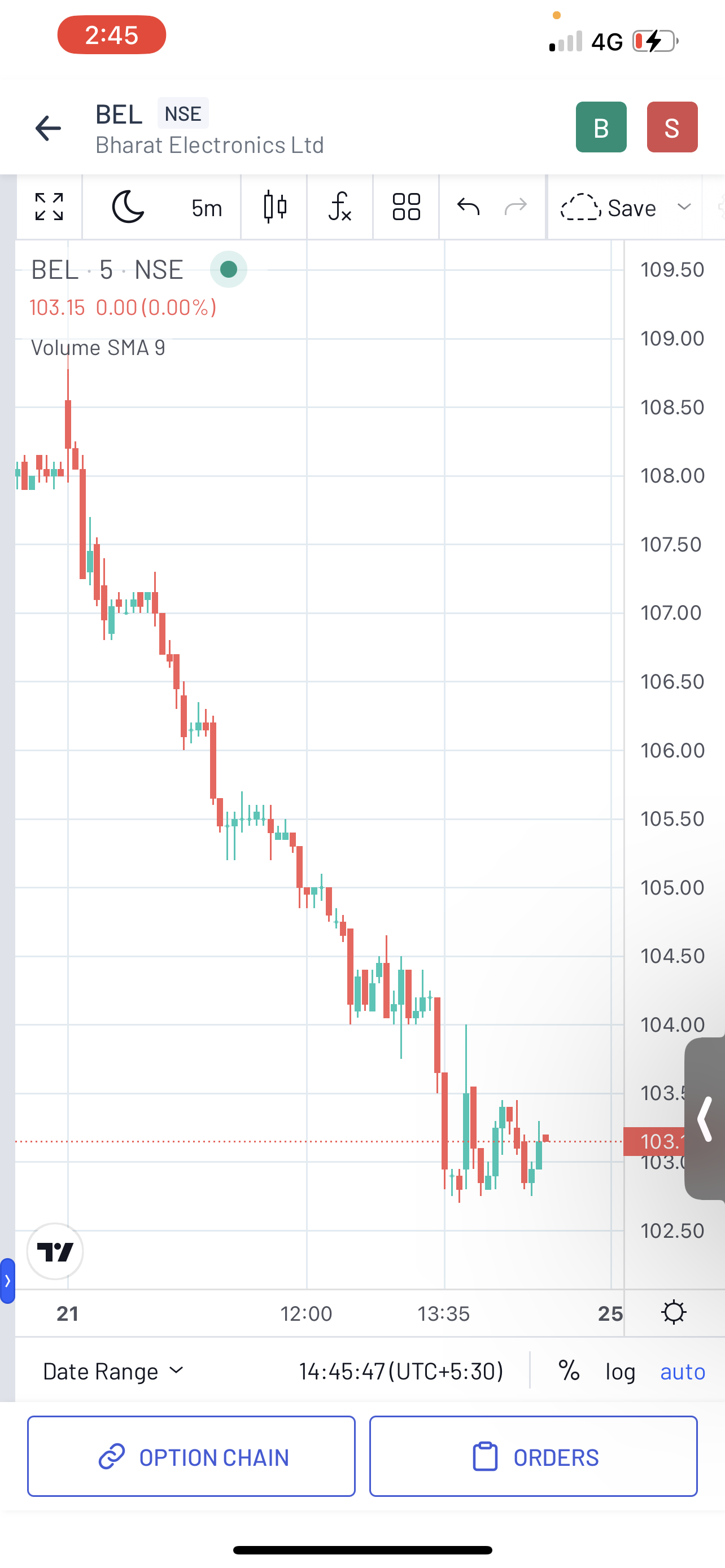
Plus, now commodities users will also have access to the Option chain.
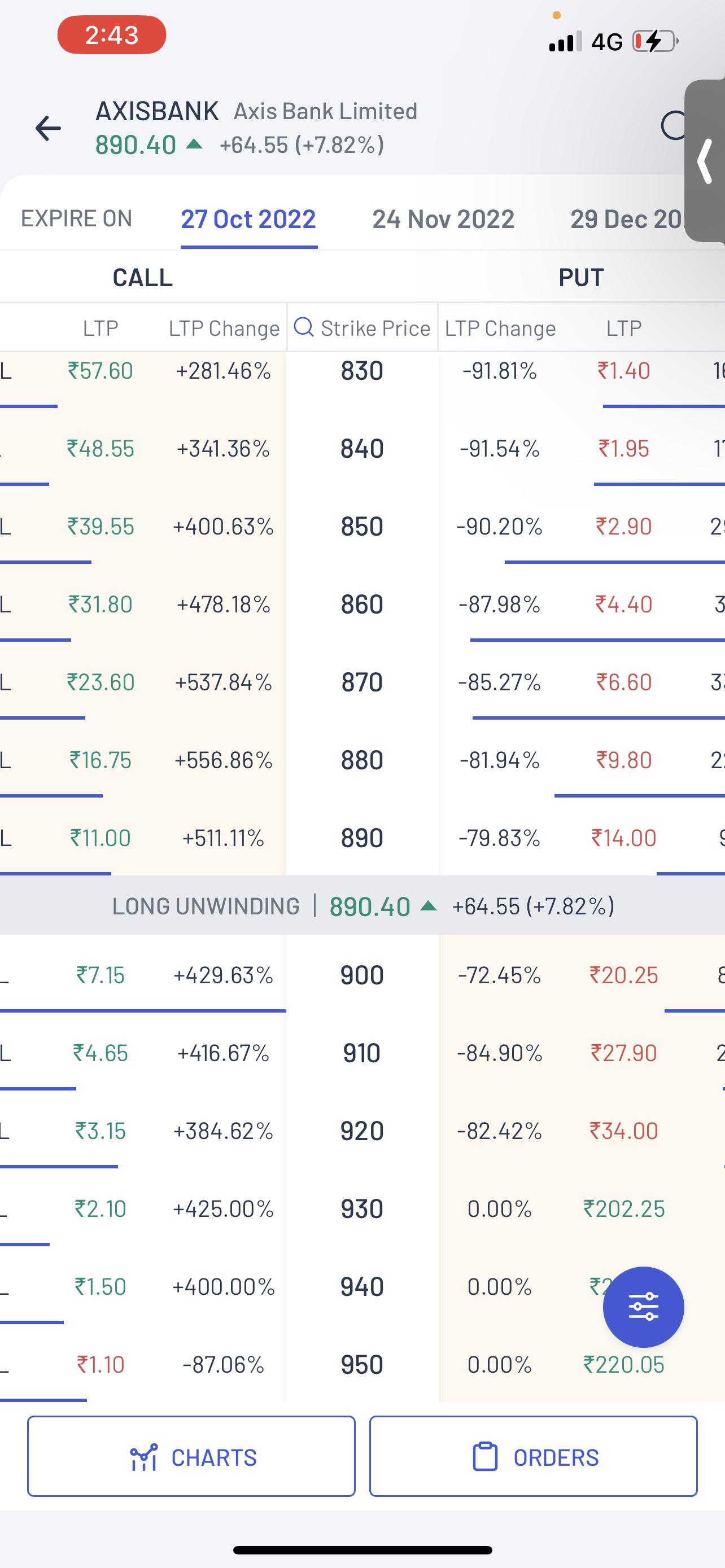
2. Option Chain Enhancements: For the comfort of the user, the design of the Option Chain has been simplified.
A: Shortened Buying Process
In the past, the process of buying an option was lengthy. For faster execution, we reduced the journey:
On the short view, select the Option Chain ➡️ user will land on the long overview final Open Chain. The process is shortened for faster execution.
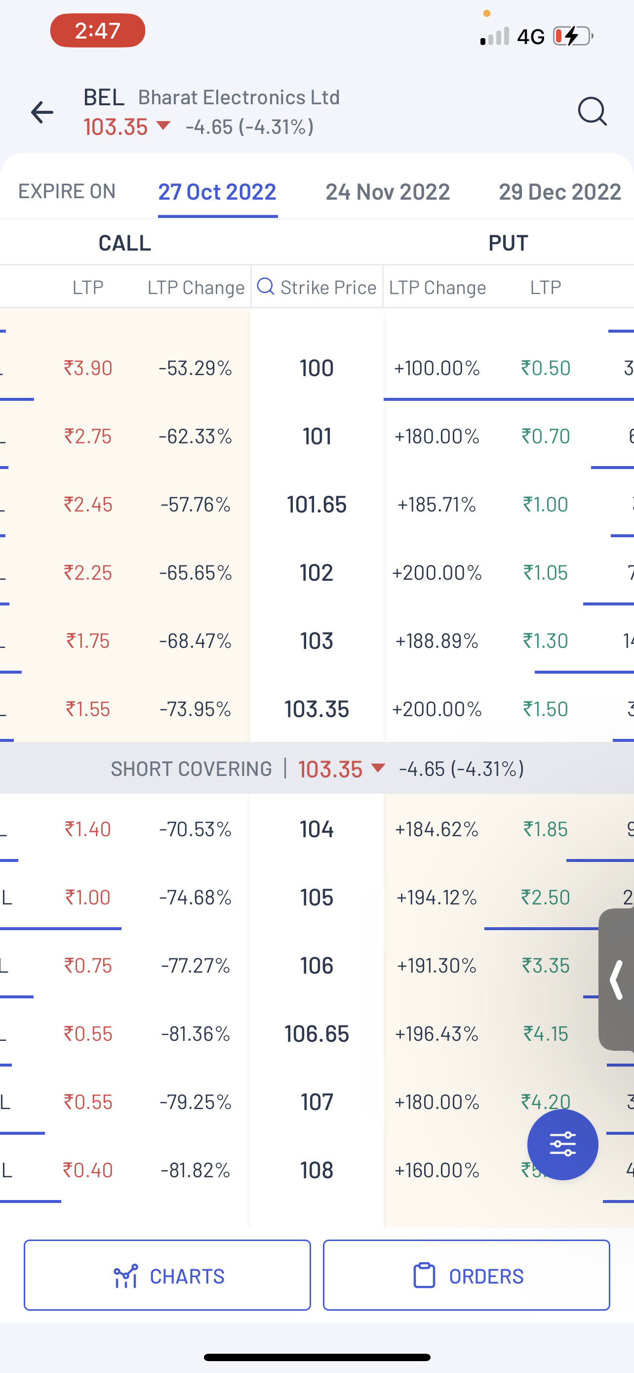
B: Option Change Layout Makeover
The layout of the Option Change was cluttered, creating a gap between the company and any new user. There were a lot of data rows for both Call and Put sides. So we further simplified it while maintaining the essence of the page. One of our major lookout points in the new update was not to create any annoyance for the existing traders. So we kept all the necessary information but in a more compact form. We removed the OI & OI change option and presented it visually. We introduced a “line” in Option Change which visually represents the OI position of any particular contract. There is a line for each of your contracts that tells you your OI in the option chain. The process is shortened for faster execution.
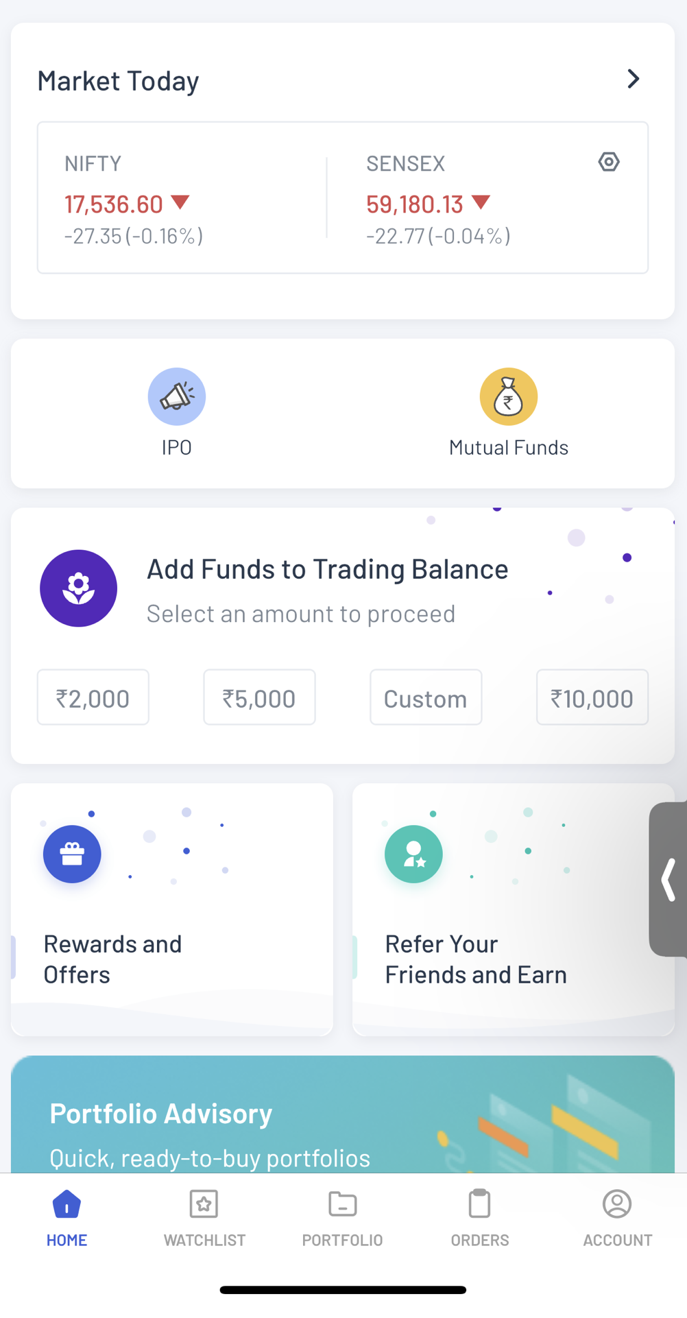
3. Options Watchlist: For a more accurate decision-making process, a new dedicated options watchlist is provided for easy discovery of the most active contracts.
We wanted to increase the discoverability of the Options for the traders to make the users easily understand which contracts that are most active. We have provided a Watchlist. The watchlist now gives you a list of the Top 20 contracts which are most active which gets updated every 15 mins. This will help the users to take a quick decision without going into details.
4. Payments Improvements: We have done several updates on payments to give users the best experience.
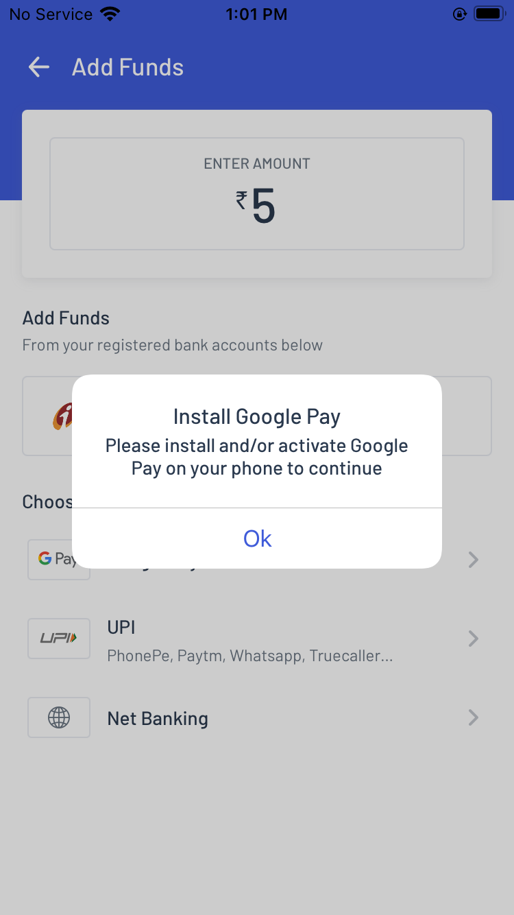
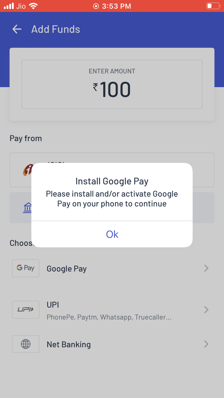
Error Message On Pop-Up Notification:
Previously while paying through UPI apps, the users did not get an error message on their pop-up notification. Now, as soon as the users select Phone pay or Google Pay and it is not present on their mobile. A pop-up will be displayed to the user informing them to install the app first to proceed with payment. This will help the users to identify the error and proceed accordingly.
Blank Space Omission:
The users used to get a blank page after selecting the net banking payment mode. Now as the user selects the net banking payment mode, a message and loader will be displayed instead of the blank space. The new change will help build a better user experience.
![]()
Cancel Transaction Confirmation
While making a net banking payment, if the users by mistake click ‘Back Arrow’ on the top left or ‘Back Button’, they used to get directly redirected to add funds screen. It was leading to the cancellation of the whole process. Now, if the users click the ‘Back Arrow’ on the top left or ‘Back Button’ of the device, they will get a displayed pop-up to confirm if the users actually want to cancel the transaction or not. This will help the user to make an informed decision about leaving or staying on the payment page.
![]()
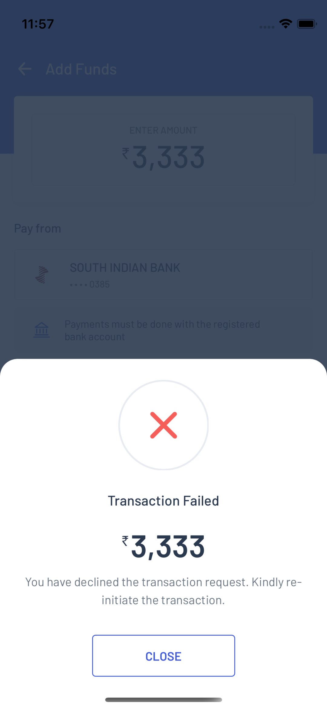
Specific Error Message
While there was a failed payment, the user used to get a generic failed status. For a smoother experience, a specific error message will be sent like: Card Number Error. This will help the user to understand the error and take the necessary steps.
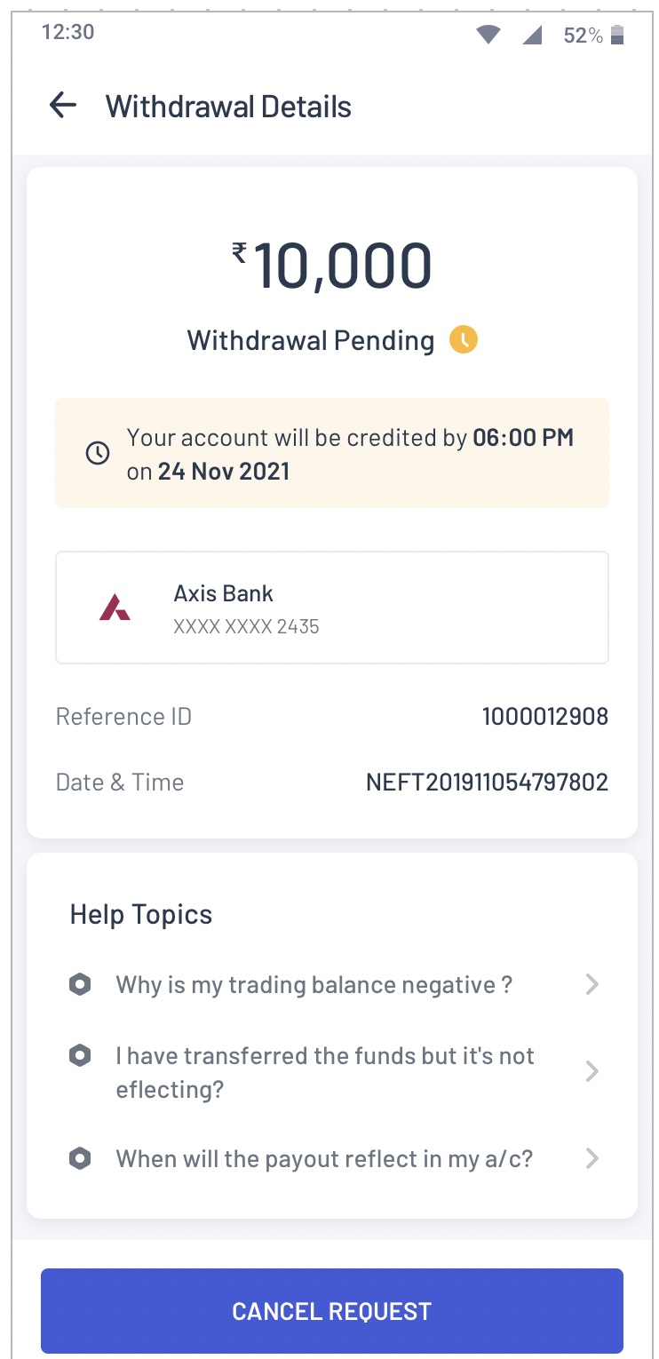
Withdrawal Fund
A while ago, the users had confusion about understanding the current status of the withdrawal fund. Now user gets a detail list of all the transactions.
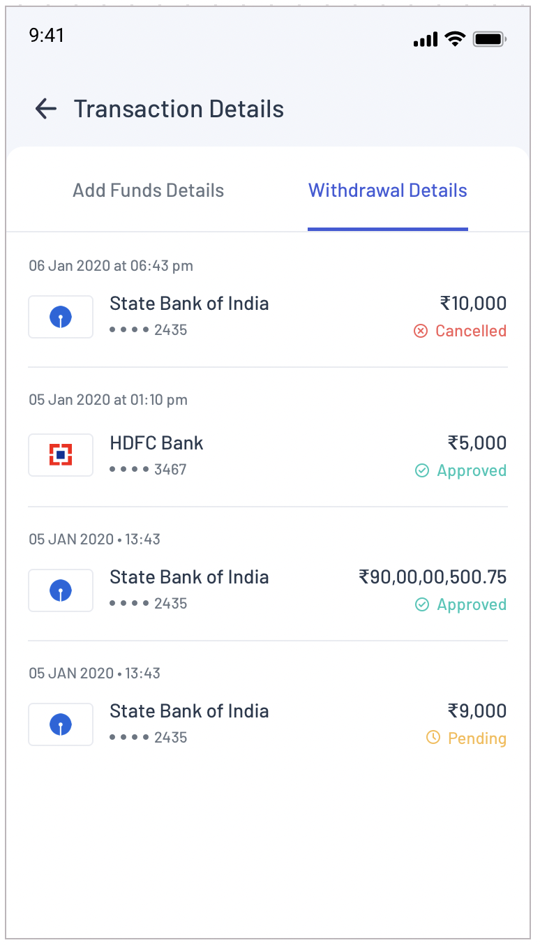
Fund Credit Timing
Before, withdrawal time was not displaced. Now, the expected fund’s credit timing should be displayed for e.g. ‘Your account will be credited by 6:00 PM on 24 Nov 2021’. This will help the traders to keep track.
Inclusion Of Transaction Details In “My Account”
Previously, the transaction details link was not displayed in the trading balance summary. The transaction details link will be available on “My account”. On clicking on the ‘View Funds Transaction Details’ link, the screen will display the transaction details page. This will increase the accessibility for traders.
![]()
UPI Per Transaction/day Limit Increase
Previously, the UPI per transaction/day limit was creating problems for the users. Now, users can add funds between 1 Lac to 2 Lac through UPI Payment Method. This will increase the credit limit for the users.
![]()
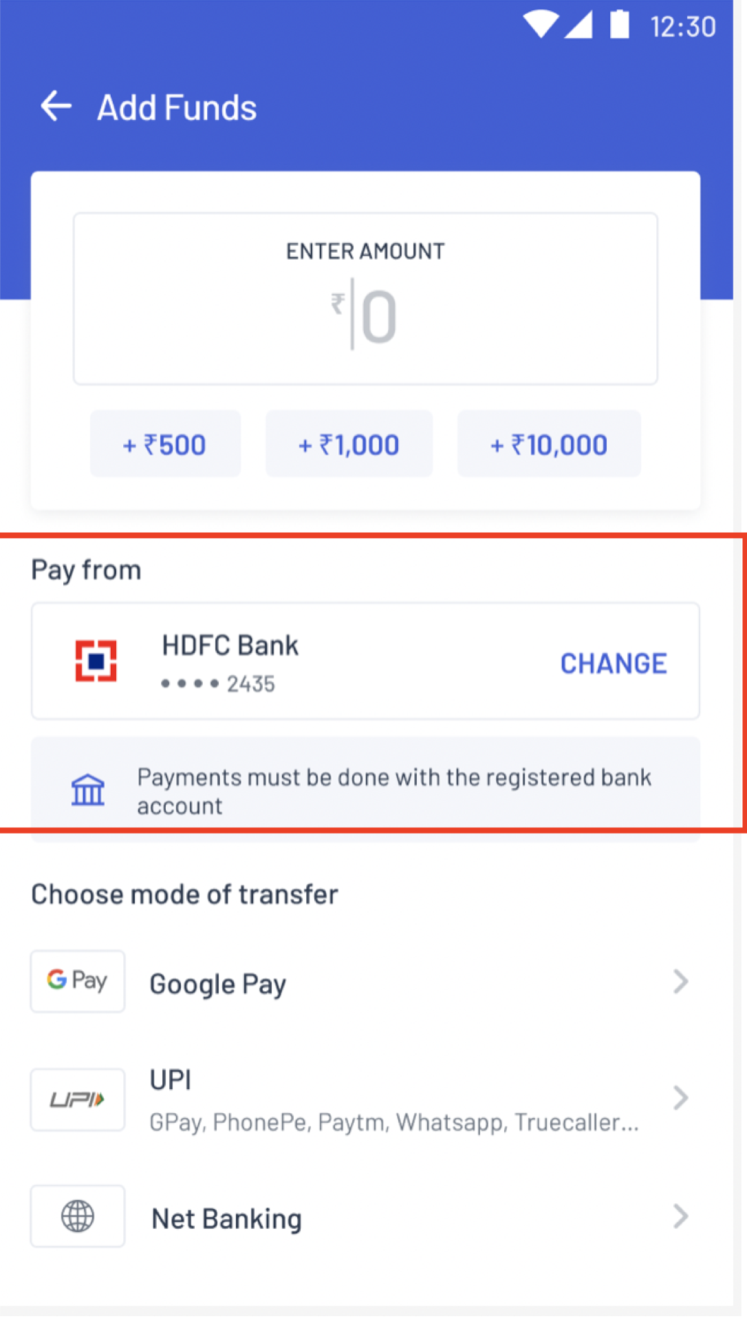
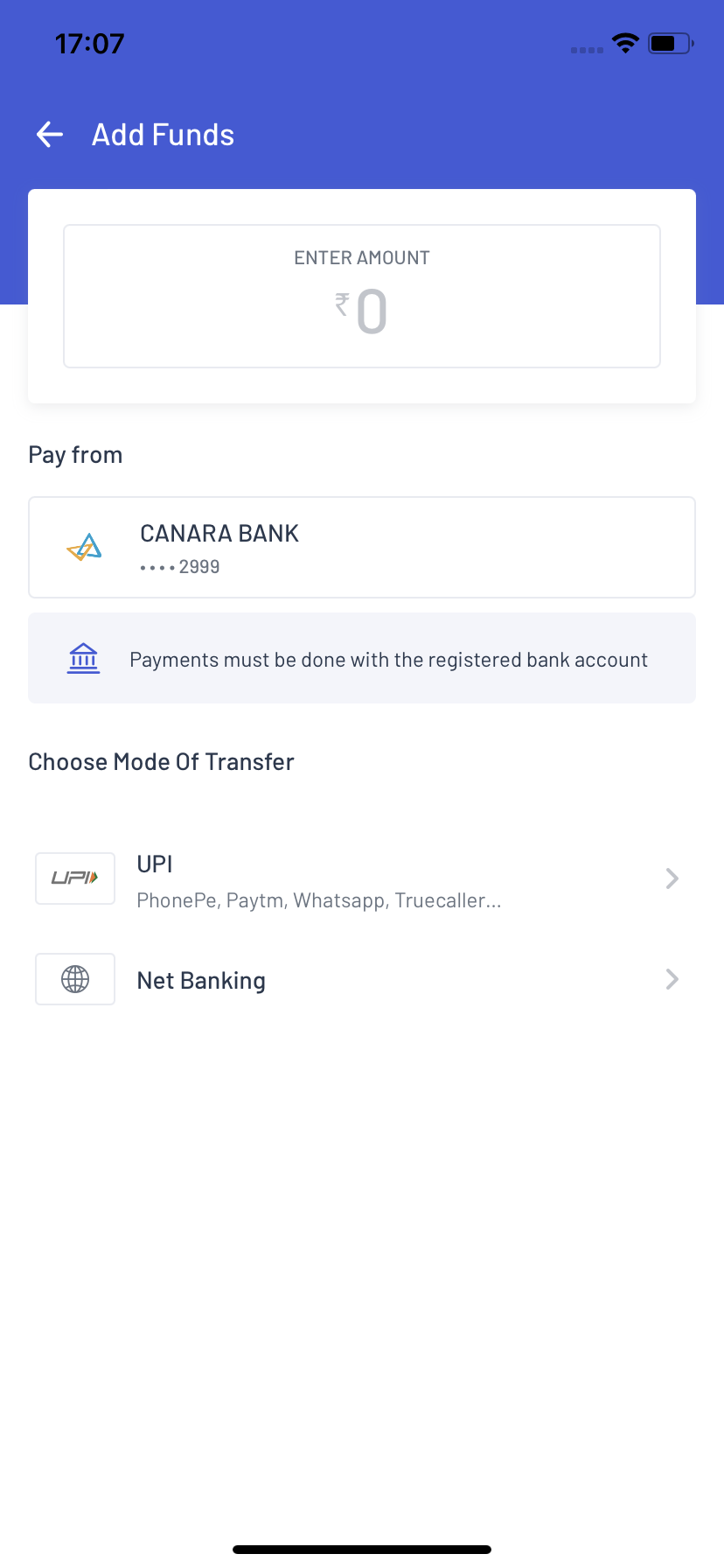
Bank Selection Message
In our existing version, there was no display of the correct message for selecting the bank. In the current version, below the bank selection, the message will come as ‘Payments must be done with the registered bank account’. This will help the user to select the correct bank and payment mode to add money.
Default Netbanking Option
In the old version, for various users, net banking was not displayed. The option is displayed by default. For all the users. Now one can choose the payment option with their ease.
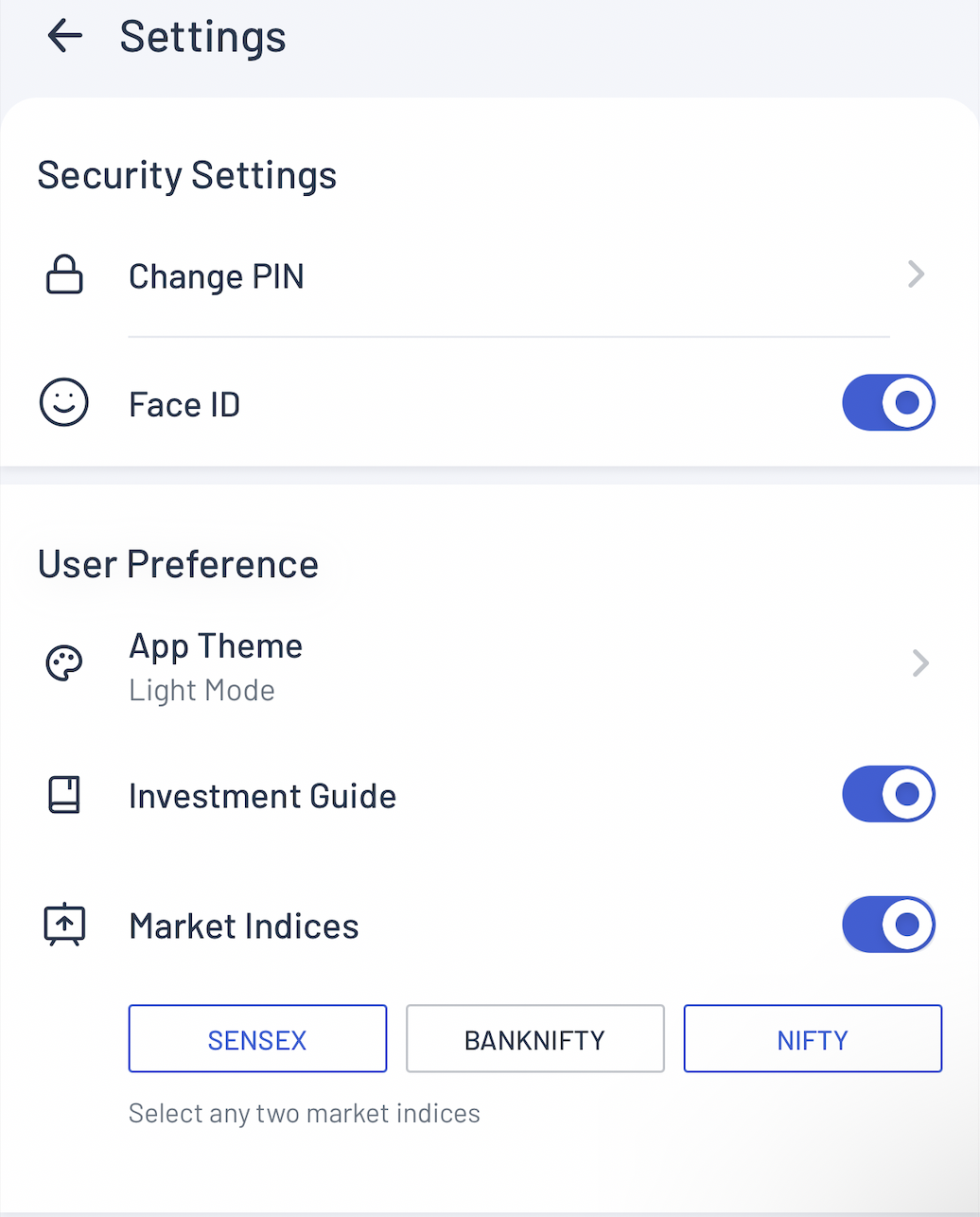
5. Selecting the preferred Index: Easier selection of preferred Index from the setting icon.
Previously, there was no option to change the default Indices on the homepage. This was creating confusion among the traders. To change the Indices, the user had to go to the setting where the option was under the Filter icon. We have now provided a Global Icon on the homepage. Once users click on that, they will be redirected to the options of choosing the Indices (max 2 can be chosen). We have reduced the confusion by giving Global Icon to both the pages: Homepage & Watchlist. Any change in the Indices on any of the pages will be reflected on both pages.
6. Other Changes:
We are continuously working to provide you with the highest innovation and technology.
Our aim has always been to provide the best for our users. We believe that the best version of a trading app comes from users’ feedback and viewpoints and we have tried our best to incorporate them all.
So if you are a new trader or investor start your own journey with us by downloading our application.
Our android version is coming soon! Stay tuned.
Published on: Oct 21, 2022, 4:53 PM IST
We're Live on WhatsApp! Join our channel for market insights & updates

Get the link to download the App